This is the story of 3 Friends from 3 different countries who enjoy sharing their love for scrapbooking with their readers.
Voici l'histoire de 3 Copines vivant dans 3 pays différents qui vous donnent rendez-vous chaque mois pour partager leur passion du scrap...
Affichage des articles dont le libellé est Scrap RDV sept 2010. Afficher tous les articles

21 septembre 2011

Monika Wright - Vieilles Photos/ Heritage Photos

Hello all! Today, we're delighted to welcome the talented Monika Wright who has made a fabulous mini just for Scrap RDV!
Bonjour à toutes! Aujourd'hui, nous avons l'immense plaisir d'acceuillir la talentueuse Monika Wright. Elle a réalisé un mini en feutrine sur le thème du mois et ce rien que pour nos beaux yeux!

When I began thinking about heritage photos, my mind immediately went to gift ideas for my Mom's birthday which is on September 22nd.  Never one to do "just a card" I decided to use photos of my brother and I as youngsters as a fond memory for her. Having just purchased a die cutter and a bracket shaped die, I wondered how it would do cutting felt. Beautifully, of course, so I went from there.
En réfléchissant à ce thème, j'ai tout de suite pensé réaliser un mini pour les 70 ans de ma Maman, le 22 septembre. Je ne suis pas du genre à faire juste une carte pour un anniversaire alors j'ai recherché de vieilles photos de mon frère et moi et je me suis mis à l'ouvrage. J'ai fait l'acquisition d'un die en accolade et j'avais très envie de couper de la feutrine avec.

Here's the result...a felt mini book with old-fashioned hand stitching to boot! I freehanded the script as I stitched along, no pre-planning, therefore the imperfection of it all.
Et voici le résultat...un mini tout doux, avec un petit air suranné et des points de tiges pour témoigner de mon amour. Ce n'est pas parfait mais c'est voulu!


After cutting all my felt page pieces, I rummaged through my embroidery floss and chose two rather subdued tones to add to the vintage, heritage feel and that number ribbon just seemed so fitting for a birthday. Don't you think so, too? Now for a peek {and some giggles} at my heritage photos with those oh, so vintage clothes and my, "Oh, Mom, do you really have to cut my hair yourself?" haircuts.
Après avoir découpé tous me smorceaux de feutrine, j'ai cherché dans mes cotons à broder des teintes un peu "passées" pour renforceer l'atmosphère "vintage". Le ruban avec les chiffres semblainet parfait pour l'anniversaire vous ne trouvez pas?
A présent et juste pour rire, je vous laisse jeter un coup d'oeil sur les photos de mon frère et moi petits! "Maman, étais-tu vraiment obligée de me couper les cheveux toi-meme?"...hmmmmm...jolis vetements non?


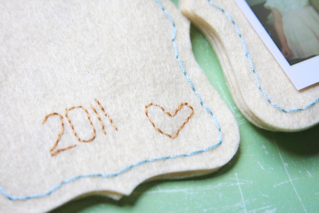
And on the inside front cover, I stitched the year and a heart! I used tacky craft glue to adhere the two felt pages back-to-back and time will tell if it holds up to being handled. The photos were adhered using foam squares and I have no doubts that those will hold well...they are stuck!
J'ai brodé l'année et un coeur sur la face interne de la couverture. J'ai utilisé de la colle forte pour coller les deux morceaux de feutrine et le temps nous dira si c'était une bonne idée. Les photos quant à elles sont tenues à la feutrine par de simples coussinets adhésifs et là je suis certaine qu'ils ne bougeront pas!


Here's my gorgeous and uber-stylish 70-year old Mom and her reaction to her mini book. My brother got a kick out of the heritage photos, too, when Mom showed the mini book to him.
Et voici une photo de la réaction de ma chère Maman en découvrant le mini. Mon frère a beaucoup ri en le regardant!


And while we're at it, I'd like to share this photo {via a mirrored window} of Alexandra, my Mom and me during a mini-trip to Chicago this Summer. Alexandra is like a breath of fresh air, so full of historical knowledge of her adopted city and such a pleasant lunch companion. Tres chic is but just one way to describe this lovely lady. Thanks for having me here today to share my love of mini books and my Mom.
Et puisque nous partageons des photos, en voici une prise cet été lorsque Maman et moi avons rencontré alexandra à Chicago.
{là, Monika me lance des fleurs mais ce sont ces deux droles de dames qui sont géniales! et j'adore les entendre parler, une avec un léger accent allemand et l'autre avec un bel accent à la Scarlet O'Hara ;-) }

5 septembre 2011

Jennifer Larson - Heritage Photos

Hello, today, I'd like to introduce you another friend of mine: Jennifer Larson.
Bonjour, aujourd'hui, j'aimerais vous présenter une autre scropine: Jennifer Larson.


Jennifer Larson is a high school English teacher, wife to the biggest Star Wars fan in the world, and mother to two boys, the 2nd and 3rd biggest fans. She has been scrapbooking since 2002 and currently is on design teams for Ella Publishing, Sketch Support, and GCD Studios. She blogs at Midwest Scrapgarden (http://midwestscrapgarden.blogspot.com/) and tweets under the name Buffyfanlarson (http://twitter.com/#!/buffyfanlarson).

Jennifer enseigne l'anglais dans un lycée américain du Midwest. Elle est mariée à un dingue de StarWars, maman de deux garçons (égalment fans de la Guerre des Etoiles!). Elle fait du scrap depuis 2011 et fait aussi partie de plusieurs D.Ts dont Ella Publishing, Sketch Support et GCD Studios. Son blog s'appelle Midwest Scrapgarden et elle tweet sous le nom de Buffyfanlarson.(http://twitter.com/#!/buffyfanlarson)

***

I'm not an expert at PSE7 (what I have), but I do some basic work on the photos. Here's some tips for what I tend to do when I scrap with heritage/older photos:

Je ne suis pas une experte de photoshop element 7 mais j'aime m'en servir pour améliorer l'aspect des vieilles photos:

1. Scan. That one's probably obvious.I keep all heritage photos in a separate file in my computer.
1. Scanner les vieilles photos et les ranger dans un dossier spécial "vieilles photos"

2. I tend to do a color correction, especially with photos that have been damaged by acidic adhesive (think 70s photo albums). If the photos are otherwise flawed--fading, e.g.--I'll adjust lighting and contrast as well.
2. je corrige la couleur surtout pour les photos qui ont été endommagées.

3. For serious imperfections, I might use the clone stamp tool if it's something small. Then I would use an action or a texture to mask the imperfections. On Early Magic, I used Pioneer Woman's Seventies action on the photos. It evened out the color a bit, which I had to do since some had been damaged by acid. On Summer of 1986, the photos were fading, so I adjusted lighting, then added a texture overlay from Fudge Graphics (http://www.fudgegraphics.com/category/textures/) and reduced the opacity.
3. Pour les grosses imperfections, j'utilise le tampon et j'aime aussi beaucoup les actions de Pioneer Woman et je recommande les overlays de Fudge Graphics.

4. I tend not to enlarge heritage photos; they get pixelated. I tend to make them around the same size as the print I scanned. (Online photo developers often tell you if the quality of the photo will be bad for the size you want to print).
4. Je n'agrandis jamais les vieilles photos qui deviennent "pixelées". 

5. When I finally scrap with the photos, I don't limit myself to vintage products. I pick products to reflect the spirit of the subject. I went for a beachy feel for Summer of 1986, I picked subdued Disney colors for Early Magic, and I picked some traditional winter colors for Skating Show.
5. Enfin lorsque je scrappe des vieilles photos, je ne me limite pas à l'utilisation de produits "vintage". Je préfère choisir des décos qui s'accordent à l'ambiance des photos ( ambiance de plage pour la page Summer of 1986, teintes passées pour celle de Disney, décos traditionnelles pour "Skating Show")


1 septembre 2011

New Month/New Theme - Nouveau Mois/Nouveau Thème

Hello, Hello!  I'm not going to talk about the end of the summer because I never want to see it end! However, we are entering the beautiful month of September which a very studious month for quite a few of our loved ones. With Fall right around the corner, we tend to look back more, to reminisce about the past and so we thought September would be a good time to tackle "old" photos. By "old photos", we mean: "heritage photos", from the very very old pictures to the ones of our childhood. We'll have some well-known and fantastic guests share their approach and projects and I'll start by introducing a very dear Friend of mine: the talented Jamie Pate. I invite you to visit her very inspiring blog, you'll see the good news she's sharing there! Jamie rocks and has a big heart. Please help me make her feel at home at Scrap RDV!

Bonjour, Bonjour! Je ne parlerai pas de la fin de l'été parce que meme si j'adore l'automne, j'aimerais que l'été soit comme les Fingers:"juste un peu plus grand". Le joli mois de septembre est là, il rime souvent avec "rentrée","sérieux". Avec l'automne, l'humeur est plus propice à la réminiscence aussi avons-nous pensé qu'il serait de bon ton de sortir quelques unes de ces "vieilles" photos pour enfin en faire quelque chose. Alors, que voulons-nous dire par "vieilles photos", et bien nous parlons des très très vieilles, du style: "mais c'est qui ces gens?" à celles de notre jeunesse, plus du style: "mais j'étais super mimi toute nue avec mon rateau". Ce mois-ci, nous aurons aussi des invitées de marque qui partageront leur approche et leur réa. et nous commencerons par la talentueuse Jamie Pate. Vous pouvez visiter son blog en cliquant ici. Merci de m'aider à l'acceuillir chaleureusement!

***

We'll be back shortly to announce the last month's "Coup de Coeur".
Nous revenons vite vous annoncer les "Coups de Coeur" du mois dernier.

14 octobre 2010

COUPS DE COEUR

Here we are at the end of our 2nd edition. Luckie has been one amazing Guest-star and the three of us would like to thank her! We also want to thank all of the participants, the friends who came and wanted to participate but couldn't, the ones who commented and the those who stayed in the shade ;-)

Et nous voici arrivées à la fin de cette deuxième édition de Scrap RDV sur notre nouveau blog. Notre Guest-Star Luckie a été gégé! (géniale et généreuse!) Les Copines et moi tenons à la remercier! Merci également à toutes celles qui ont participé, celles qui auraient voulu mais n'ont pas pu, les amies qui sont venues et ont laissé un commentaire et celles qui sont venues et ont choisi de rester à l'ombre ;-)

It was very difficult for each of us to choose a "coup de coeur".
I (Alexandra) had to have two: Maud and Moo Lover. Both of these ladies touched me both with their talents, their creativity and humor. Thank you Ladies! A little something has been sent your way already.


Virginie here! Choosing ONE "coup d e coeur" was literally impossible for me. So I've decided to send each of the participant a card ;-) If you were kind enough to send me your address, that would be grand! Thanks to all of you and to Luckie!

Coucou!! Hmm... à mon tour (Virginie) de vous donner mon coup de coeur... Alors, je vais faire la mauvaise élève ce mois-ci. Et oui! Impossible pour moi de choisir. Vous m'avez toutes épatée par votre talent, vos bonnes idées, votre gentillesse. J'ai été touchée par vos réalisations, vos commentaires, vos participations... Et j'ai décidé de vous envoyer à toute une p'tite carte faite main... Alors si vous pouviez m'envoyer vos adresses postales sur notre toute nouvelle adresse mail scraprendezvous@gmail.com, vous seriez trop mignonnes!! Je vous envoie tout ça ce week-end... Encore un énorme MERCI à toutes et à notre super Luckie!!


Hello everyone! Agata here to announce my "coup de coeur". It goes to Charlotte for her great and original layout "Eté 2010". Beautiful and fun colors, the original approach to the sketch just made my heart leap! Thank you Charlotte for taking part in the challenge and sharing with us all your creativity! My warm thanks go also to all of you and to the incredible Guest Star we had this past month, Luckie! Believe me, discussions behind the scenes were hot and we just had so much pleasure that words cannot express it all! THANK YOU!!!

Bonsoir tout le monde! C'est à mon tour (Agata) d'annoncer mon coup de coeur. Il va à Charlotte et sa magnifique page "Eté 2010". Les splendides couleurs et son approche très originale du sketch m'ont tout simplement séduits! Merci Charlotte d'avoir participé au défi et d'avoir partagé ton talent avec nous tous! (Si tu peux nous communiquer ton adresse au scraprendezvous@gmail.com ce serait très aimable!) Mes remerciements chaleureux vont aussi à vous, chers lecteurs et lectrices du blog ainsi qu'à Luckie, notre Guest Star incroyable! Croyez moi, les discussions dans les coulisses étaient très animées et nous avons eu tellement du plaisir que les mots ne peuvent pas l'exprimer! MERCI!!!

12 octobre 2010

LAST TAKE ON LUCKIE'S SKETCH

Hello everyone! Agata here to share with you the last take on Luckie's sketch. If you're like me, you need a lot of words to share the story, to tell all there is to tell. Imagine this: an almost three year old boy is sitting at the table with a book he's just discovered. It's maybe a bit complicated for him yet. But he watches every detail and... asks questions! Plenty of those!!! Yes, I'm talking about my son and something that happened at the beginning of the year. I was totally unable to write down all of his questions so I filmed him instead. Then, I sat down and wrote down everything that happened. In fact, it was a dialog because I was also asking him questions or I was repeating things he said but in Polish so he could learn. There were not too many pictures about that event and the main story is this dialog. One additional observation: he started asking the "why" questions a lot starting right then. But how to fit so many words on a restrained space of a 6x12 layout? Well, I decided to put it in the background. I printed it in light grey so it's not overwhelming but if someone feels like reading it, he or she still can. One can also skip part of it when he or she gets the concept and go forward to the pictures and the "real" journaling. This way, the dialog creates some sort of a trendy text background. As for a recycled element, there are those colorful circles which are small paper muffin cups that I took from the kitchen which is also where I stood when these observations took place.

Bonjour tout le monde! C'est Agata qui vous parle pour vous présenter la dernière version du sketch de Luckie. Si vous êtes comme moi, vous avez besoin de beaucoup de mots pour raconter une histoire. Imaginez la chose suivante: un petit garçon de presque 3 ans est assis à la table et lit un livre qu'il vient de découvrir. Ce livre est peut-être encore un peu trop compliqué pour lui. Mais il observe chaque détail et... il pose des questions! Beaucoup de questions!!! Oui, je suis en train de parler de mon fils et de quelque chose qui s'est passée au début de cette année. Je n'étais pas du tout en mesure de noter toutes les questions qu'il posait je l'ai alors filmé. Puis, grâce à cet enregistrement, j'ai pu tout écrire. En fait, c'était un dialogue puisque moi aussi je lui posais des questions ou je répétais des choses en polonais pour qu'il apprenne. Il n'y avait pas beaucoup de photos pour aller avec ce qui s'est passé et le plus important était ce dialogue. Avec une observation supplémentaire: c'est à ce moment là que mon fils a commencé à demander "pourquoi". Mais comment mettre autant de mots sur un espace aussi restreint qu'une page 6x12? J'ai décidé d'imprimer le tout sur le fond de page. Je l'ai fait en gris assez clair pour que cela ne soit pas trop lourd visuellement. Mais si quelqu'un veut lire le texte, il peut toujours le faire. Il peut aussi sauter une partie une fois qu'il a compris "le truc" et aller plus loin vers les photos et le journaling à proprement parlé. De cette façon, le dialogue crée le fond de texte qui est assez "en vogue" en ce moment. Pour ce qui est d'un élément de récup', j'ai utilisé les caissettes colorées pour truffes que j'ai piqué dans un tiroir de la cuisine d'où j'observais mon fils lisant son livre...


And that's it! You still have a couple of days to join in the fun and add the link to your creation into the widget in the left side bar. We're looking forward to seeing your creation!

Et voilà! Vous avez encore quelques jours pour participer et ajouter le lien vers votre création dans le gadget de côté gauche du blog. On se réjouis de la voir!

9 octobre 2010

LUCKIE'S SKETCH ON A 7x4 LO

Hello!! Now it's Virginie's turn!!
I want to show you my last layout created from Luckie's sketch. This time, I decided to make a page for my "a page/a week" album. Its size is a bit special : 7x4 inches.

Coucou!! C'est à Virginie de prendre la parole maintenant!!
Je voudrais vous montrer la dernière page faite selon le sketch de Luckie. Cette fois, j'ai décidé de faire une page de mon album "a page/a week". Sa taille est un peu spéciale (tout droit sortie de ma tête!!) : 18x10,5 cm.


On this layout, I kept the main ideas of the sketch : the clustering, the title, the bottom line... my goal was to use this 6x12 skecth on a different size and to keep enough "white space" so essential...

Sur cette page, j'ai gardé les grandes lignes du sketch : le titre en 2 parties, le clustering, la ligne en bas... j'ai juste chercher à l'adapter à un format différent tout en cherchant à garder ce "vide" si nécessaire...


Because the pages of this album are 2 by 2 , this is its neighbor where I wrote down the journaling...

Et puis parce que les pages de cet album vont par 2, je vous montre sa voisine où est écrit le journaling...


J'espère que vous avez apprécié ce RDV, que vous aurez vu, appris, découvert des choses qui vont ont plu...
Le Scrap RDV continue jusqu'au 14 octobre... alors, vous avez encore quelques jours pour nous montrer votre façon à vous de travailler le skecth de notre guest-star!


I hope with this Scrap RDV you saw, you learned, you discovered few things you enjoyed...
The Scrap RDV is going on until the 14th... so you still have a few days to participate!

7 octobre 2010

LUCKIE'S SKETCH ON A 8 1/2 X 11 L.O

Hello! Alexandra here, to share with you a page made with Luckie's sketch in mind but with a few twists:

*  the format is no longer a half-page ( 6x12 ) but a 81/2 x 11.
*  the position of the photo on the page is the same but the clustering has been lightened.
*  the title is no longer placed on a corner but right on top of the picture
*  the journaling here is more important than in Luckie's original sketch


Bonjour! C'est moi alexandra, qui reprend la main pour partager une page partie du sketch de Luckie mais interprétée très librement:

*  le format n'est plus le meme, au lieu d'etre une 15x30 cm, nous avons un format A4 ( américain )
*  la position de la photo par rapport à la page est la meme mais l'effet de clustering a été allégé. ( du clustering light donc! )
*  le titre n'est plus en angle mais au-dessus de la photo.
*  le journaling occupe une plus grande place ici.


To conclude, we can say that no matter what the original sketch looked like to begin with, the important thing is to take make it yours. See what makes you like a certain sketch ( the clustering, the white space...) and roll with it! We'd love to see your pages, you have until the 14Th!

En conclusion, nous pourrions dire que le plus important lorsque l'on trouve un sketch qui nous inspire est de comprendre pourquoi il nous plait ( est-ce l'espace négatif? l'effet de clustering?...). Le fait de comprendre ce qui nous plait chez l'autre nous permet de mieux centrer notre propre style et après, il n'y a plus qu'à se laisser aller ;-) Nous aimerions beaucoup voir vos interprétations, fidèles ou libres, vous avez jusqu'au 14 de ce mois.

2 octobre 2010

LUCKIE IS BACK!


Luckie
Bonjour tout le monde!
Voici mon deuxième essai sur mon propre sketch, allègrement déformé!


En fait, j'ai surtout insisté sur la récup !
Quasiment tous les éléments de la page ont été récupérés !
J'ai ainsi recyclé :
- un ruban arc-en-ciel d'emballage [d'une des nombreuses peluches de Lili !]
- du scotch de peintre
- l'étiquette carrée d'un jouet
- une chute de photo à l'envers (sous la photo)
- et du calque (sous les gouttes de pluie)
j'espère que ça vous plaît !
N'hésitez pas à participer ! vous avez déjà fait des merveilles !!!!!
@+
Luckie
Hi Everyone!
Here's my second take on my own sketch!
Okay, I have to admit I went really far from it this time!
Actually, I mostly focused on the 'recycling' challenge... almost all the elements on this half-page are recycled!
Here's the stuff I used:
- the rainbow tape was wrapping one of Lili's stuffed bears
- some masking tape
- the square-label comes from a toy
- a piece of photograph on the wrong side (under the real photograph!)
- some tracing paper under the rain drops...
I hope you like it!
And now your turn to try this challenge! Some of you already made wonders!
CU soon!

29 septembre 2010

WHITE SPACE - L'ESPACE NEGATIF


Coucou !

Aujourd’hui, on s’est dit qu’on vous proposerait bien un p’tit post un peu plus théorique… ça vous dit ? Alors suivez-moi !!

Comme vous vous en êtes rendu compte, l’espace négatif est prépondérant dans les réas de notre Guest Star Luckie.
Mais qu’est-ce que cet espace négatif ? A quoi sert-il ? Comment composer une page, une photo en s’appuyant sur lui ?
Et puis déformation professionnelle oblige, on jettera un œil sur l’utilisation de l’espace négatif en matière d’architecture de l’habitat…

C’est parti !


Hello, Virginie here. As an interior designer, I thought it would be interesting to take a closer look at a recurrent element both our guest-star and our design team use all the time: the concept of WHITE SPACE.
I'm inviting you to follow me as we explore what that white space is, what purpose it serves and the different ways one can use it on a page or picture.

We call "white space" or "negative space", the space of a page or composition of any kind left blank. ( space between the lines, margin, elements on a page...)
Its purposes are: to define and create balance, to drag viewers's attention to the main focus of the composition. It also allows gives the reader a place to rest and can act as a link between different subjects. Furthermore, white space almost always gives the composition a touch of class, "instant elegance" so to speak.


L’espace négatif, c’est le fond de la page alors que l’espace positif est l’espace utilisé par les éléments de la composition (scrap, photo, dessin…).
En d’autres termes, l’espace négatif c’est l’espace laissé vierge sur la composition. Ce « vide » va permettre à la réalisation de respirer, de mettre en valeur l’élément principal et d’apporter une touche « professionnelle » et d’élégance à n’importe quelle composition.

The "white space" is the background of the page and also the space between the various elements of the composition. In other words, "white space" it is the space left blank on the composition. This space allows the creation to "breathe", to emphasize the main element, to bring elegance and a "professional" touch.


Regardez ces deux images, le message est le même, la photo aussi mais l’effet obtenu est complètement différent : la première (très dense et avec peu d’espace négatif) connote plutôt un produit peu cher voir bas de gamme, alors que la seconde (ou le vide est prédominant) renvoie à une notion de luxe…

Look at these two images, the message is the same, the picture is the same but the effect is completely different : the first one (the one which is very dense) gives the idea of a cheaper product, while the second (the one which has a lot of "white space") refers to a more luxurious product...


Si on veut pousser un peu plus la théorie, on peut distinguer deux types d’espace négatif :
- macro espace négatif qui est le vide laissé entre des éléments de la composition,
- micro espace négatif qui représente le blanc à l’intérieur d’un élément : dans un journaling, dans une photo…
En effet, il ne faut pas négliger la mise en page des textes : ils doivent être lisibles, agréables à lire, aérés…

To go further on this topic, we can say that there are two kinds of white spaces :
- the "macro" one which is the space left between the different elements,
- the "micro" one which is the blank in one element like a journaling, a photo...
Indeed, the journaling is very important and to be well understood it has to be clean, clutter free.


Je pense que l’espace négatif doit être réfléchi. Je veux dire qu’il doit rentrer dans notre processus créatif comme un élément à part entière au même titre que la photo, le texte, le titre.

I think we need to give more thoughts about the negative space and that we should include it in our creative process as a real element such as photography, journaling...


On peut avoir peur de laisser trop de vide mais bien souvent le mieux est l’ennemi du bien. On va avoir à cœur non seulement d’agencer les différents éléments entre eux, mais aussi de les organiser par rapport au vide que l’on veut trouver afin d’aboutir à une mise en page harmonieuse, équilibrée et aérée.

One might be afraid to leave too much empty space... but I do believe that "less is more".When the different elements of a composition are not only well put together but also in harmony with their surrounding, that's when get a page that "works".


Cette page, la 2ème d’un ensemble de 3 pages, est une adaptation très libre du sketch de Luckie. J’ai gardé le grand espace négatif laissé autour de la photo et son « clustering » d’embellissements.
Avec un tel « vide », le regard est instinctivement guidé vers la photo . La ligne horizontal vient souligné, appuyé le point focal porté sur la photo.

This page (which is the second one from a set of 3 pages) is a free take on Luckie's sketch. I kept the big white space around the picture and the clustering.
The eye is guided to the photo because of all the white space created around. The horizontal line is emphazing the importance of the photo.


Pour ma part, je compose mes pages souvent de la même façon …
Je commence par choisir l’histoire que je veux raconter, l’anecdote que je veux immortaliser, la photo que je veux scraper.Ensuite, je crayonne, dessine des croquis à la recherche de ma mise en page : je cherche comment organiser les éléments principaux – photo(s), journaling, titre- avec les éléments décoratifs et le vide…
Il faut alors réfléchir sur quoi le regard portera : sur la photo, sur le journaling, sur un autre élément précis...
L’aménagement de l’espace négatif aura alors toute son importance pour guider le regard, mettre en évidence le point focal…


This is how I usually create a page:
I begin by choosing the story I want to tell, the photos I want to use. Then I draw sketches in order to find my layout : I'm looking for the way to organize the main elements (photo, title, journaling...) with the embellishments and with white space...
One has to envision what the main item of the page will be. The composition of the white space is be very important in the sense that it'll guide the eyes directly toward the focal point...


Cette page est la dernière du tryptique "Family". Ici encore, je voulais attirer l'attention sur la photo. La compostion assymétrique amène directement le regard dessus. L'élément décoratif dans le coin droit est comme un point final à cet ensemble de 3 pages.

This page is the last one from the tryptich "Family". This is yet another example of my attempt to capture the attention to the photo. With an asymmetrical composition , the eye is directly guided to the picture. The embellishment in the corner is like the end of the set.


Les voici ensemble - Here they are all together :


Cette notion d’espace négatif va se retrouver dans tous les domaines du graphisme, dans la photographie, les arts, l’illustration, le scrap mais aussi en matière d’agencement de l’habitat.
Au delà de tous ces aspects abordés, je pense que le « vide » laisse libre court à l’imaginaire, au voyage, à l’onirique : le lecteur va pouvoir grâce à lui voyager au-delà de ce qui lui est présenté, il va pouvoir se faire sa propre interprétation et chacun aura alors une lecture différente… c’est ce qui rend la chose encore plus intéressante! Regardez ces photos... que vous inspirent-elles?

We can find this concept of "white space" in graphic design, photography, art, illustration, scrapbooking but also in interior design and architecture.

Beyond all the different meanings of white space, I think the space left free is like an opened door to dreams and imagination : the reader will be able to make his own interpretation and then each and everyone will have a different reading... that, I believe, makes it even more interesting!
Look at these photos... what are your feelings?


En effet, en agencement d’intérieur, il faut savoir laisser de l’espace, laisser respirer la pièce pour ne pas se sentir étouffer sous les meubles ou tout autre objet de décoration…
La difficulté est alors de trouver le bon équilibre pour faire de la pièce à agencer un lieu fonctionnel, agréable, esthétique et répondant aux besoins des clients… (hmmm, je me sens comme au boulot tout d’un coup !!) .


In interior design, it's important to leave empty space, let the room "breathe" in order for the people living in that space not to feel like they're going to suffocate under the furniture or any other decorative object!
The difficulty then, clearly lies in finding the right balance, the best possible arrangement : the room has to be convenient, pleasant, nice and meet the clients' needs... (hmmm, suddenly I'm feeling like if I am at my job!).


Voilà quelques exemples en photos… Here are some examples...


J'espère que ce "petit" topo vous aura plu... et que vous aurez envie à votre tour de vous essayer à ce fameux espace négatif... en interprétant le sketch de Luckie!!
I hope you enjoyed this post... and we will be very pleased to see your take on "white space"! Luckie's sketch is the perfect example of it, so why not have a go at it?

24 septembre 2010

LUCKIE'S SKETCH WITH 4 PHOTOS

Hello! Today, I'd like to show you a "freer" interpretation of Luckie's sketch. Instead of one picture, we have 4 square ones ( taken with my iphone=>application Hipstamatic ). This time we have 2 "recycled" element:

* the title is actually the bottom part of the cardtsock ( with the brand's name which is Kesi'art and the name of the cardtock "Saveurs Estivales" = "Summer Flavors")
* the waves => the back of a fabric sticker from My LYB.

Bonjour! Aujourd'hui, j'aimerais vous montrer une interprétation plus libre du sketch de notre Guest-Star Luckie. Au lieu d'avoir une seule photo, nous en avons quatre qui forment un bloc. ( photos prises avec l'application Hipstamatic de mon iphone )
Il n'y a pas un mais deux élèment de récup':

* le titre qui est en fait la petite bande au bas de la feuille Kési'art.
* les vagues blanches => le dos d'un grand autocollant de My LYB.

Luckie's sketch:


alexandra's take:


Journaling:

One way to include some journaling with this type of page is to write/type it on a tag and slide it underneath the block of photos & embellies:

Une façon d'inclure du journaling dans ce genre de page est de l'écrire/taper sur une étiquette que l'on glisse sous le bloc de photos et embellies:


Translation in English: Gallianne Lily, you have become a little bit too big to fully enjoy this mini water park but it is so convenient and so well located that it would be a shame not to stop by it. Last time we went you told me to bring my knitting so we could stay there for a long time. 


To visit Luckie's blog, please click here.
Pour accèder directement au blog de Luckie, vous pouvez cliquer ici .